YTK
BRAND & VISUAL IDENTITY
Context
YTK is Finland’s largest unemployment fund.
It needed a clearer and more distinctive brand that felt approachable, modern and easy to use.
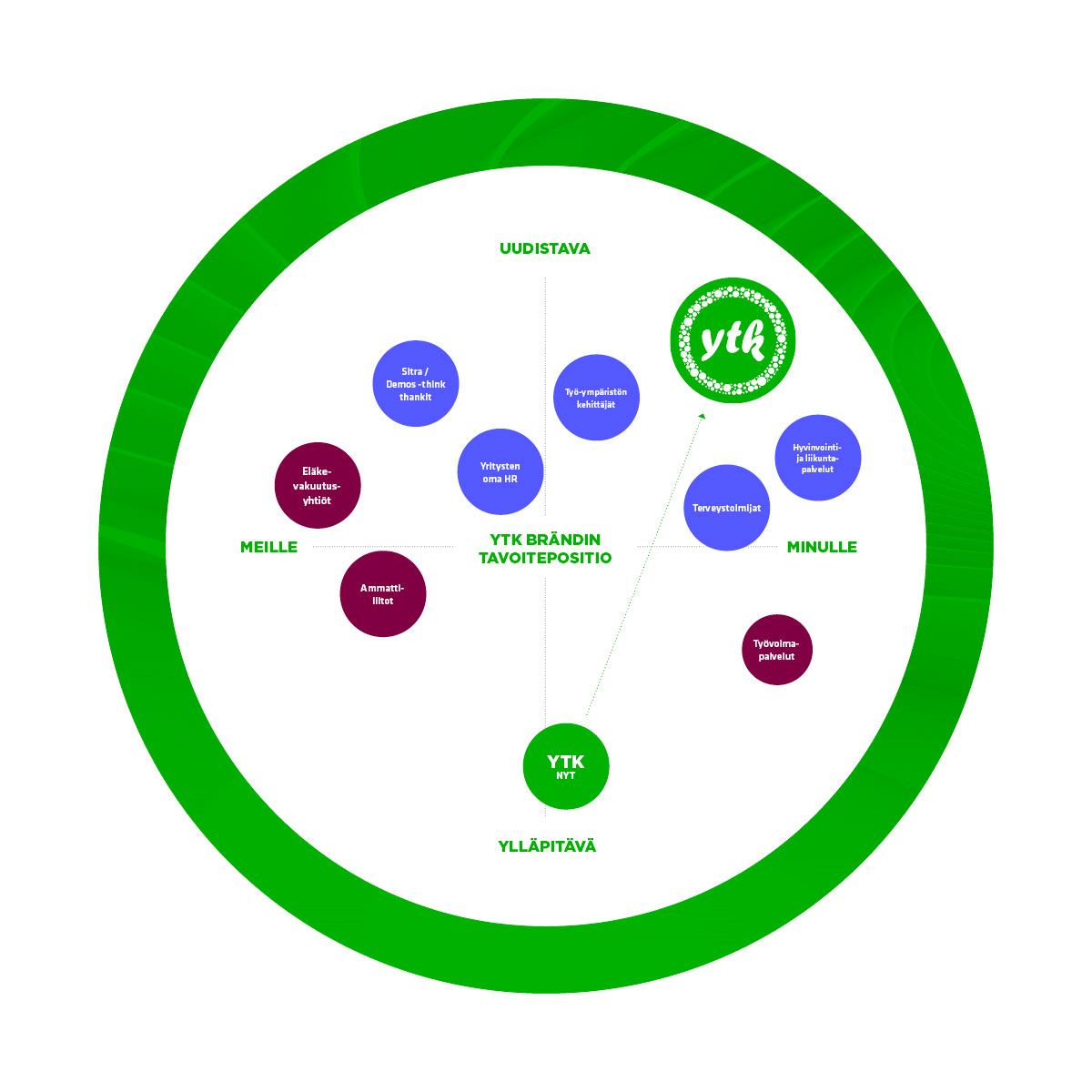
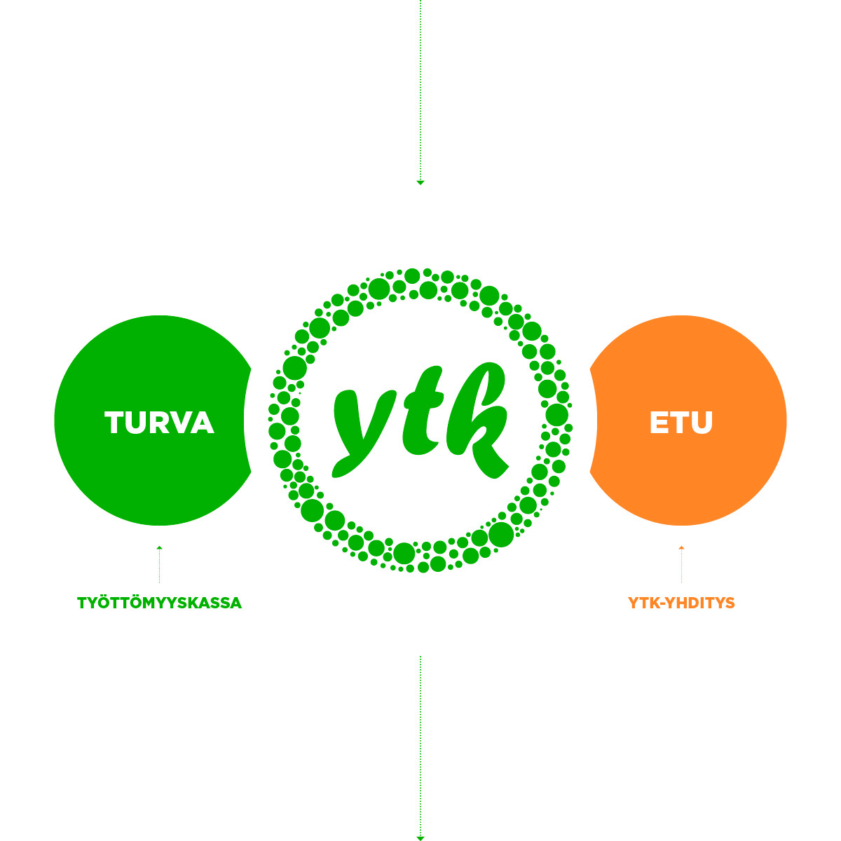
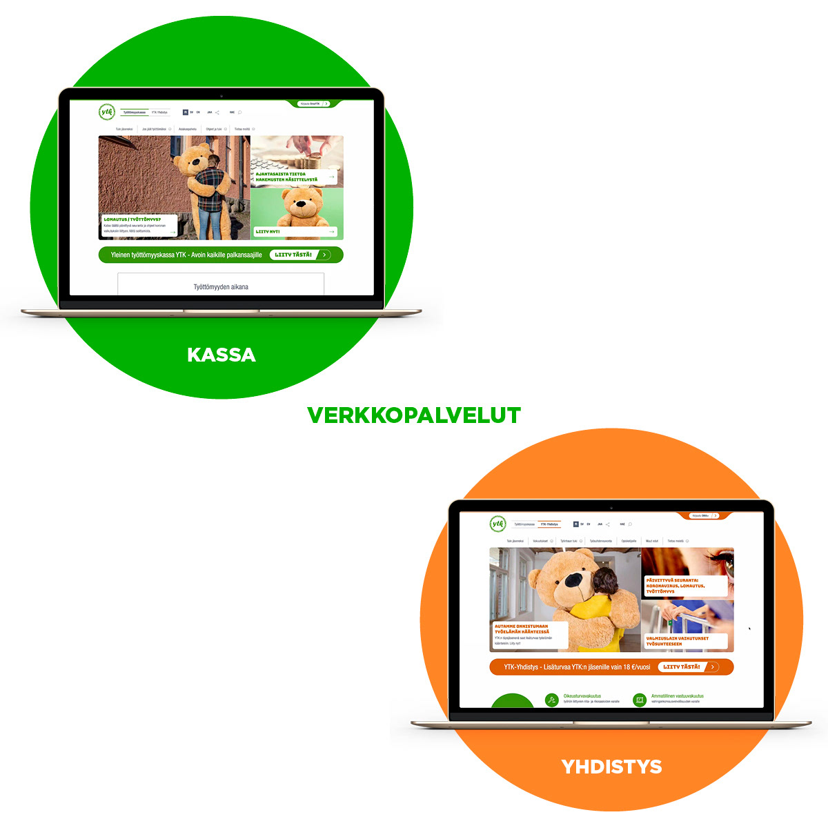
The renewal also had to bring YTK and YTK-Yhdistys closer together. One service brand with two different roles.
Approach
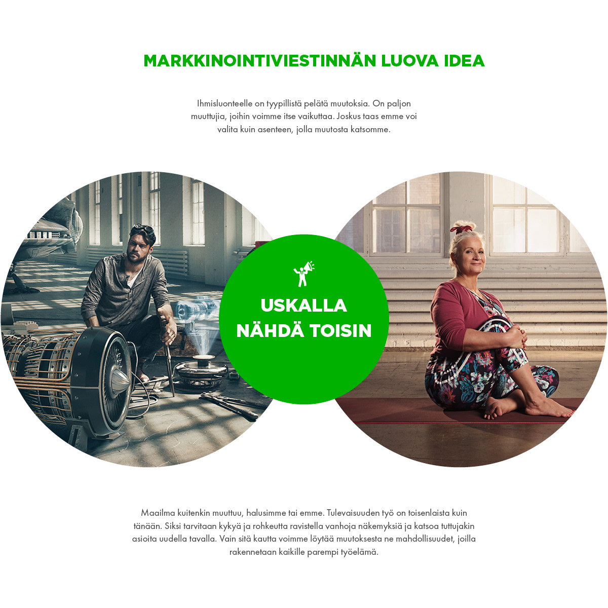
Working life changes.
YTK’s role was not only to provide security when it did, but to help people see what might become possible next.
The promise became Muutoksesta mahdollisuudeksi. From change to possibility.
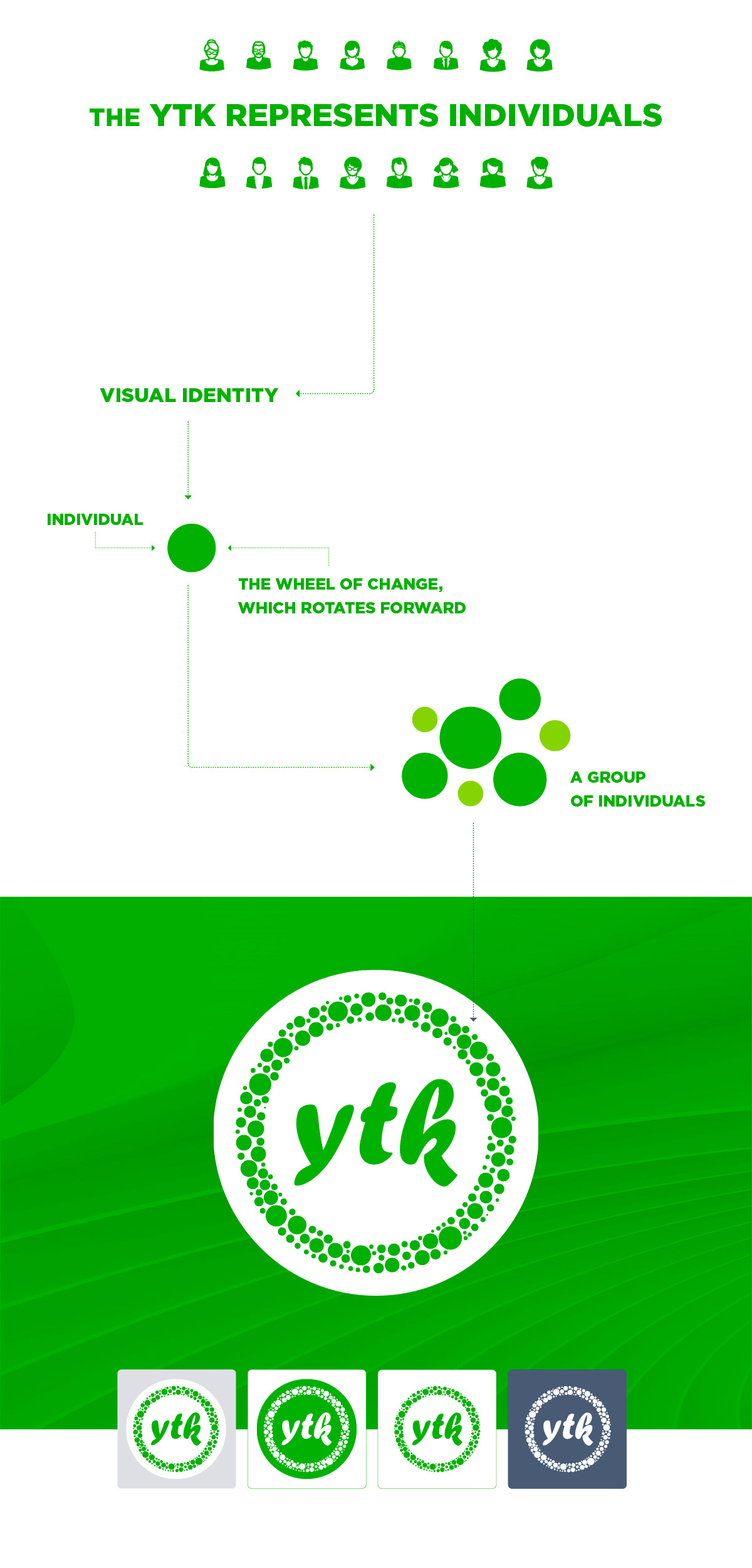
The visual identity began with a dot and a circle.
The dot represented an individual. Many dots became a community. The circle made change visible as movement.
The system was designed to feel trustworthy without becoming cold, and clear without looking bureaucratic.
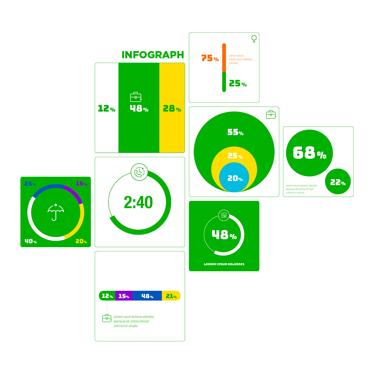
A key part of the identity was Iiris, a living, data-driven brand element that made YTK’s members visible both as individuals and as a community.
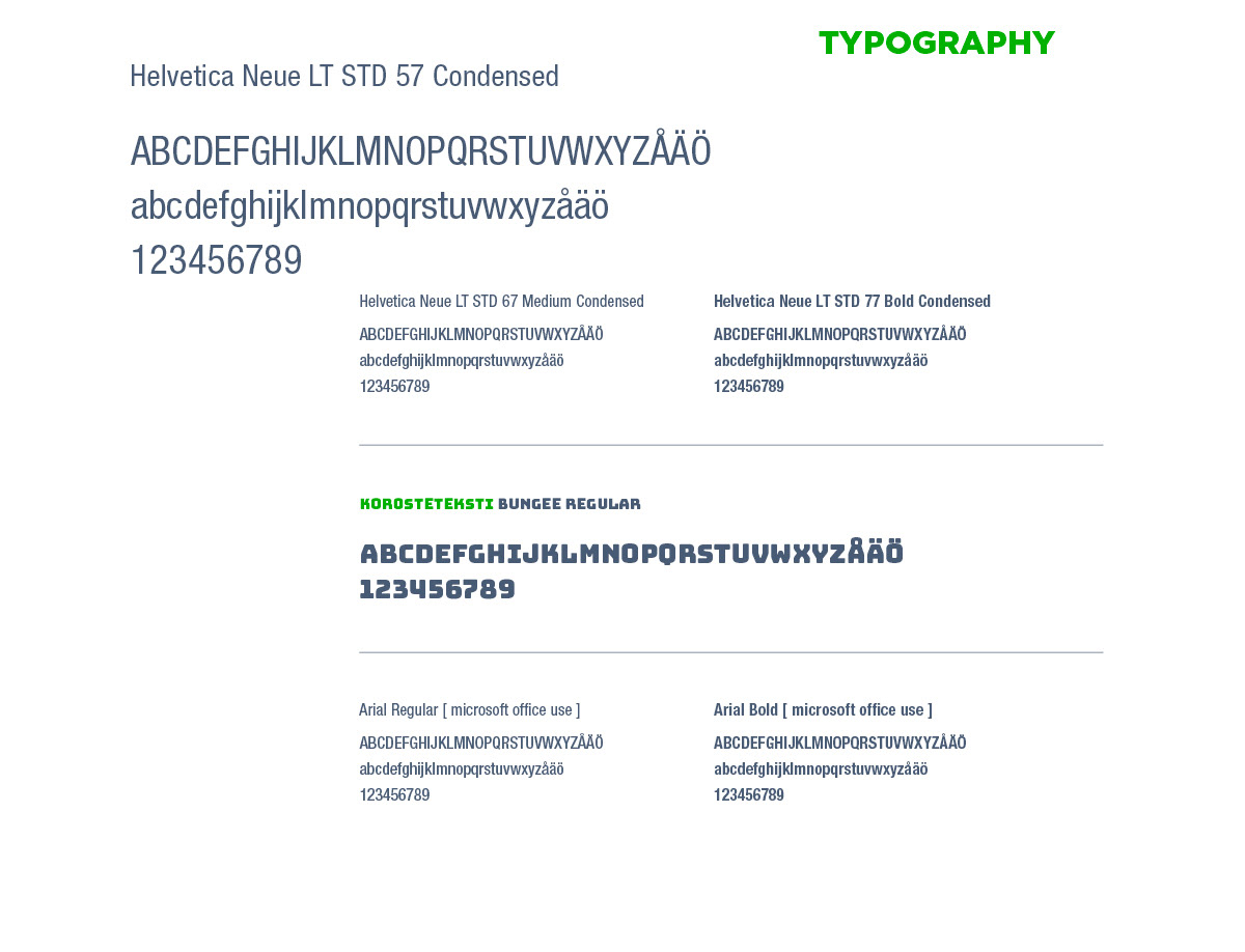
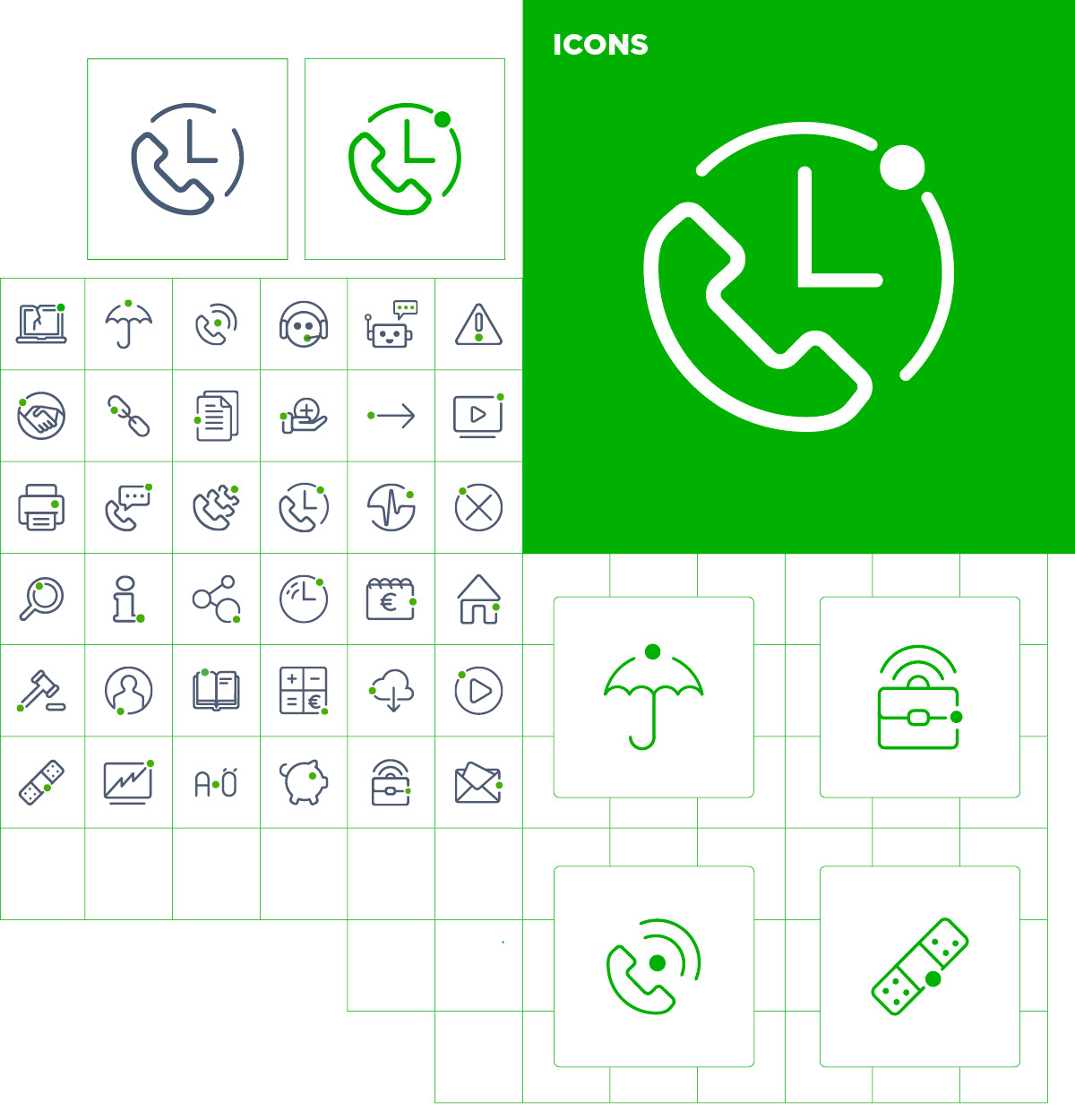
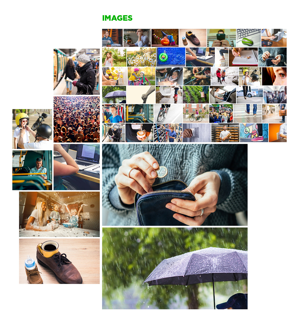
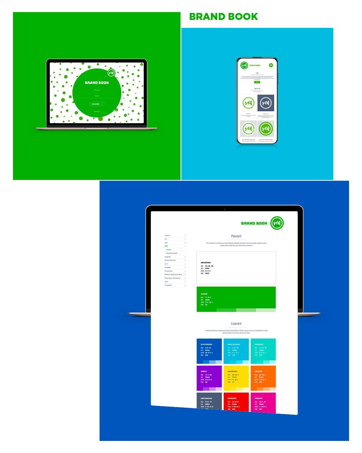
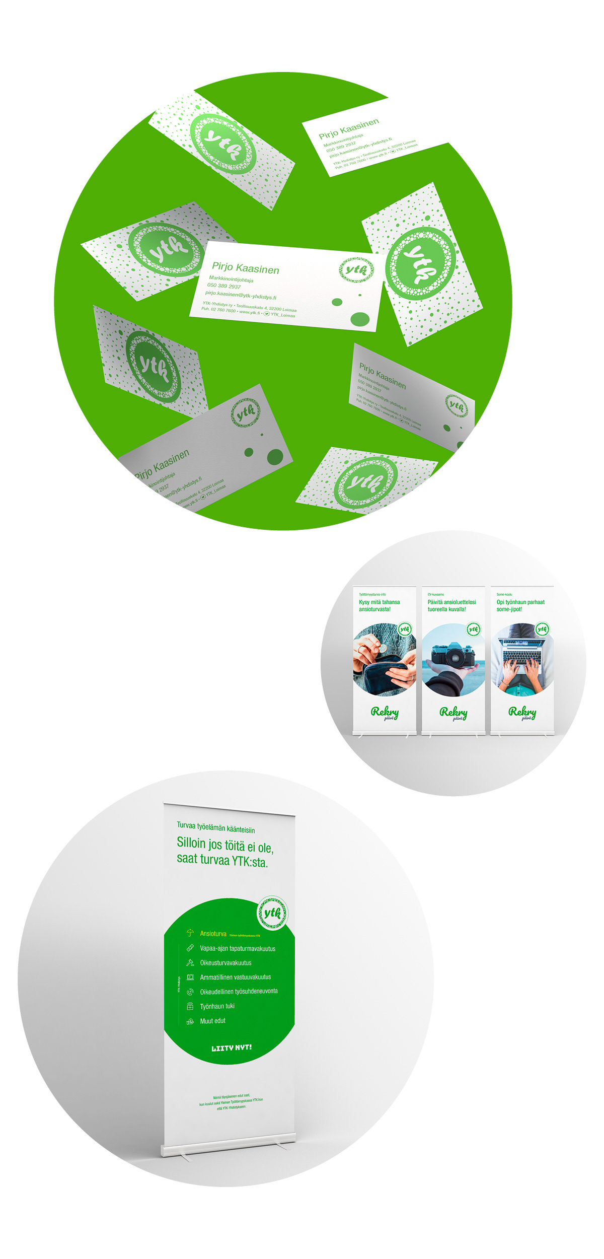
The work included the brand promise, logo, colour system, typography, graphic elements, icons, image direction, data visualisation, guidelines and applications across digital and print.
The identity became the foundation for YTK’s online services and the campaigns that followed, including Uskalla nähdä toisin ».
My Role
Art Direction · Visual Design · Brand Identity · UI/UX · Brand Guidelines
Brand identity developed together with my copywriter partner.